Clearcode
Clearcode is a software house that specializes in custom AdTech and MarTech platform development. They work with top-tier AdTech enterprises, agencies, publishers, and global media companies.
I joined the company in the spring of 2012 as a second designer and quickly became an important asset to the company. What made the difference was my approach to onboarding new clients—together we explored the problem space and sketched potential project directions. This, and my design experience, allowed me to quickly take over as the company’s Head of Design.
Over the years I’ve built a team of brand and product designers that were handling both internal marketing needs and day-to-day work of a software house, while the organization grew from a few dozen to over 100 people.
In 2020, after several years of mentorship, I passed the reins of team management to one of my associates, to focus on my next project.
At the end of 2021 Clearcode was acquired by KKCG’s Aricoma Group for an undisclosed sum.
Rafał is one of the most exceptional and versatile designers I’ve worked with. His ability to understand and articulate client needs and turn them into a clear vision is impressive. He delivers high-quality solutions that exceed expectations and his attention to detail and commitment to client satisfaction are unprecedented. The effects of his work made a permanent mark on the company and will stay with us for a long time.
Clearcode’s design team was involved in over 150 projects during my time with the company. There are a few we worked on the most, that are worth mentioning.
Darwin360
2012
This startup from Salt Lake City wanted to change how small and medium businesses used web analytics.
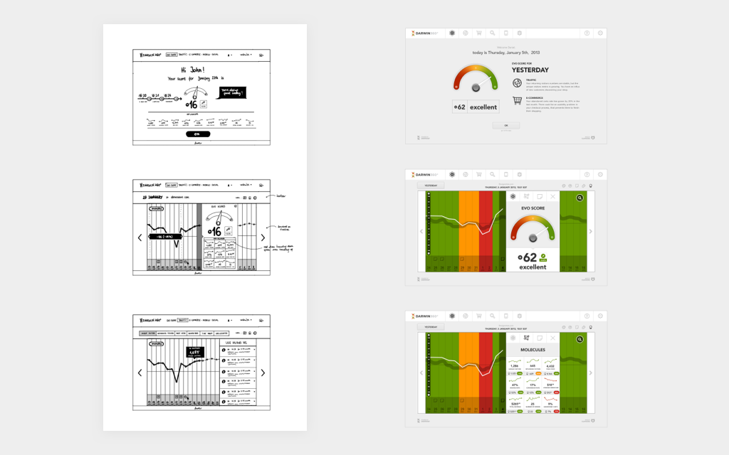
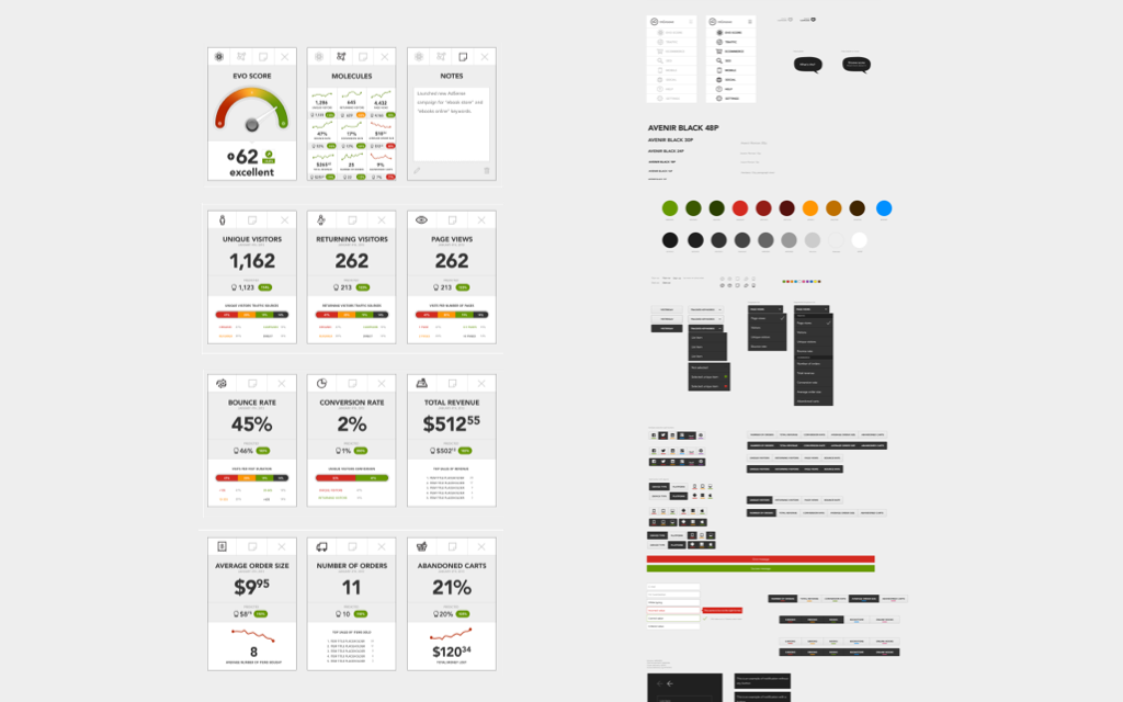
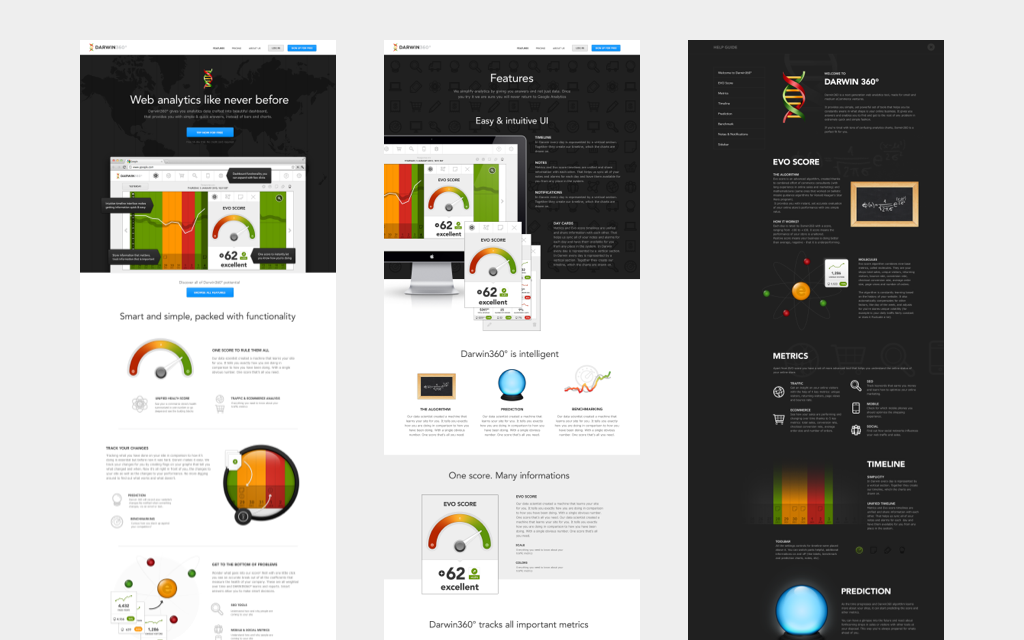
Instead of presenting them with a bunch of data tables and graphs, Darwin360 wanted to provide website owners with a Health Score—a number that represents how well the website and business perform daily. For that reason branding, information architecture, and user experience were big focal points of the platform.
We’ve worked closely with the founders and had an impact on all these aspects of the project. After completing the MVP, Darwin360 successfully raised new funding and was featured at the SVB Showcase conference, which has a long history of recognizing and supporting emerging technology companies.
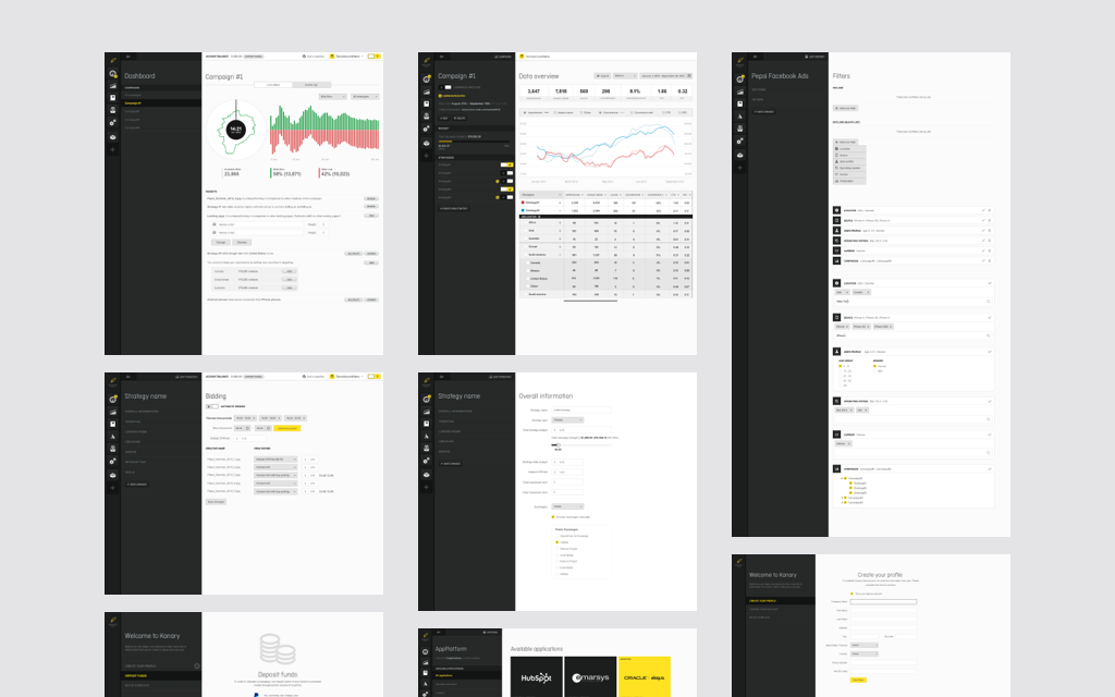
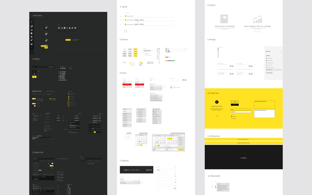
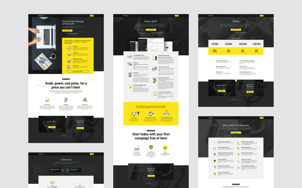
Kanary NEST
2013
The goal of Kanary was to build a fault-tolerant, scalable demand-side platform (DSP). They wanted to give advertisers an easy way to buy display ads, using programmatic and real-time bidding (RTB) technology, with transparent reporting on media spend, conversions, and commissions.
To provide marketers with access to the major biddable display advertising inventories, we integrated Kanary with AppNexus and ad exchanges supporting OpenRTB protocols, such as Nexage.
The platform was featured at the TechCrunch Disrupt 2013 conference in New York and received a lot of positive feedback from attendees.
In August 2014, Kanary NEST was successfully acquired by the online advertising giant, Gravity4.
R-Brain
2016
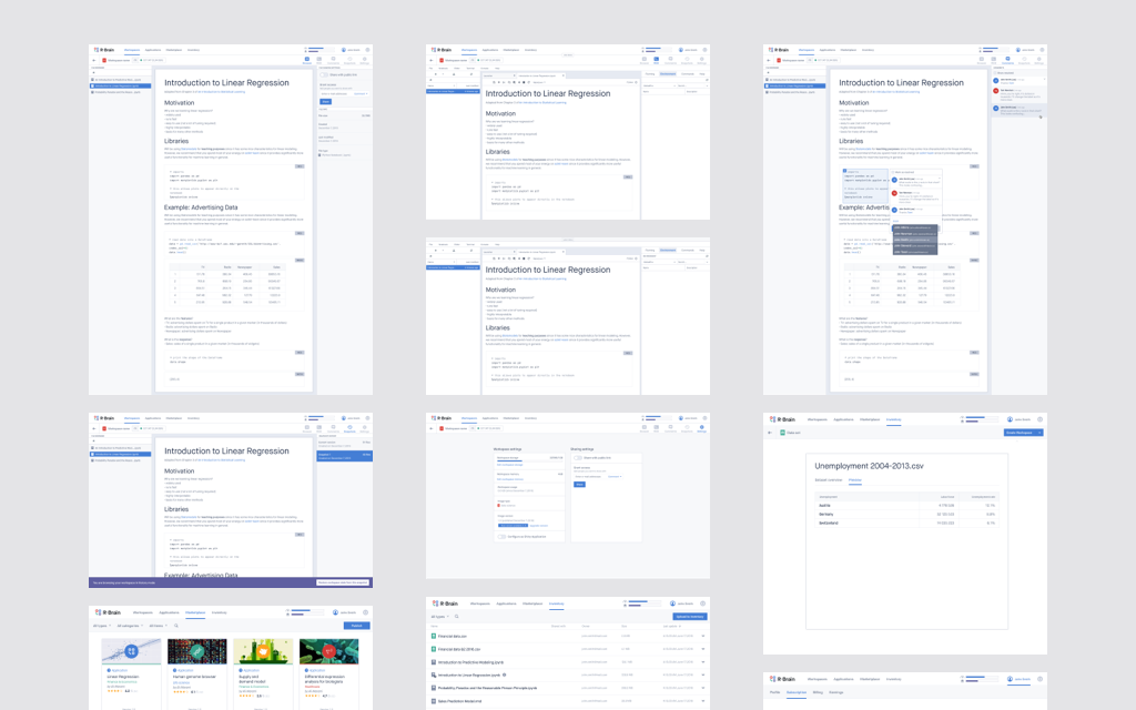
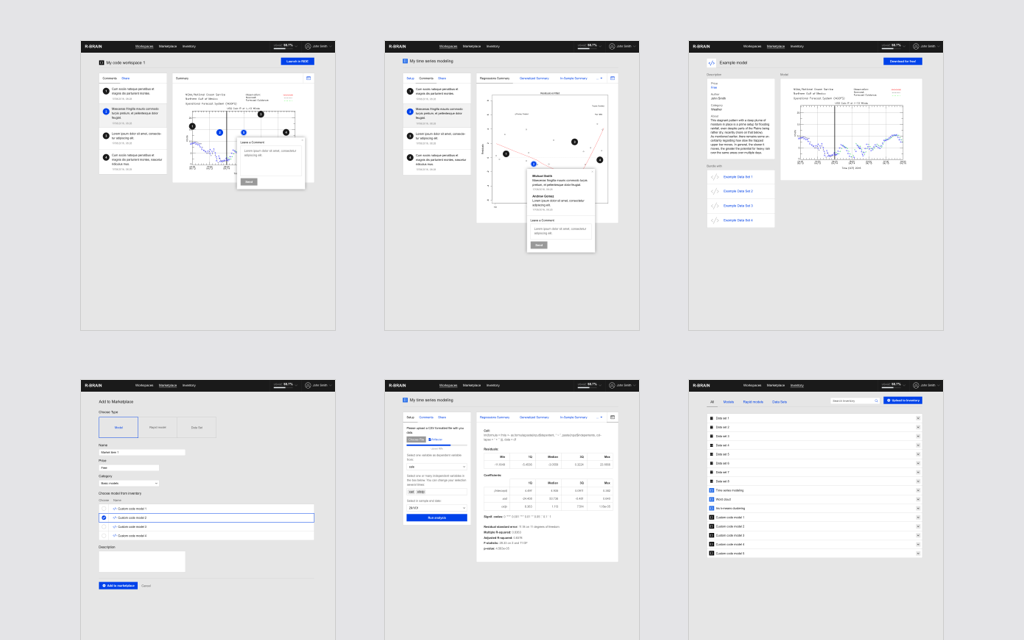
This San Francisco-based startup wanted to improve the way data science projects were organized by merging capabilities of their custom Jupyter Labs kernel written for R language and cloud capabilities enabled by the AWS platform.
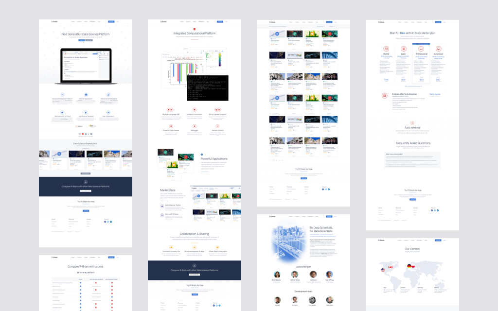
We’ve designed the brand together with the website, and we’ve prototyped the first version of the application. After validating the business use case, our clients were able to build a local team to whom we handed the project over.
Clearcode's brand
One of the first tasks after I joined Clearcode in 2012 was to modernize the branding. Back then the company was an all–purpose web software house without any distinctive qualities. This was a challenge. I’ve decided on using the company’s name as an inspiration and creative direction and set myself a goal—to come up with a logo that will stand out among local software house identities. A logo with an iconic mark that could function well on its own.
The result? After a few weeks of work, I came up with an idea to curve two pixelated letters “C” around a cube, resembling the shape of a heart.
The name “Clearcode” is built out of two words starting with the letter “C” and they were present in the domain name (clearcode.cc). The hearth was meant to showcase our passion for technology, something everyone in the company could relate to.
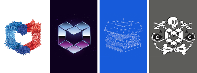
Clearcode’s emblem restyled in t‑shirts design
Starting from the left: flower, 80’s chrome, blueprint and landlubbers.
After the logo, the rest of the brand quickly followed. The first website version heavily relied on typography. Over the years it went through several iterations, and for each one, we used our new skills and learnings. The one presented below is the final one we’ve settled on.
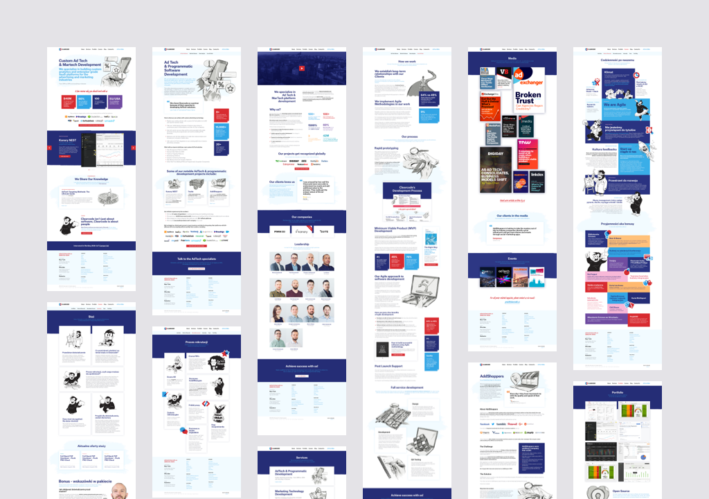
View full size image
We created a visual system that allowed us to quickly produce quality illustrations, to help leverage the attractiveness of our blog. Together with great writing it took our blog to one of the most read in adtech space.
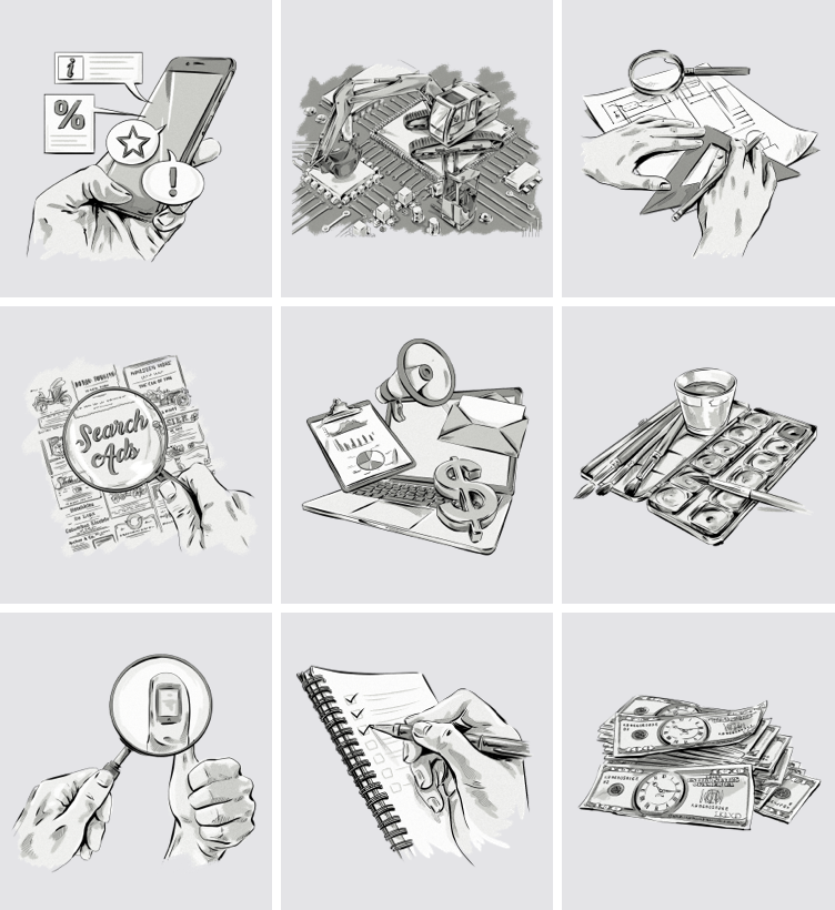
Content illustrations
A monochromatic sketch style that could be composed and drawn using stock photos gave us an easy and sure way to deliver an illustration for a blog post published every other week.
The muted illustrations were juxtaposed with colorful header typography, and a custom icon library, stylistically related to Clearcode’s logo. All of it created a memorable and unique stylistic.
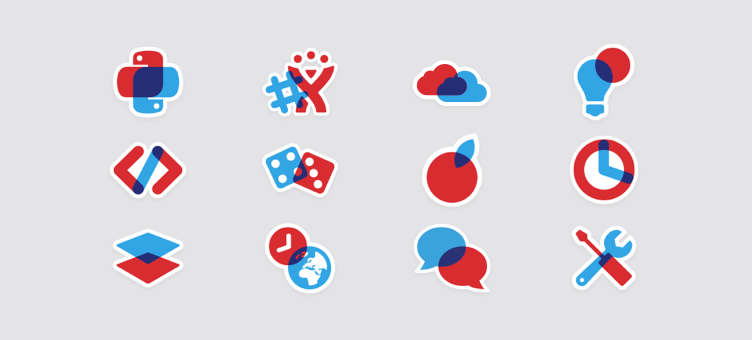
Iconography
A set of icons mimicking the glass overlap effect from Clearcode’s logo.
Employer branding
In addition to working on marketing materials, I’ve helped kickstart many successful employer branding efforts. One of the results of the joint work with the HR team were career pages for which we got an EB Kreator 2015 award.
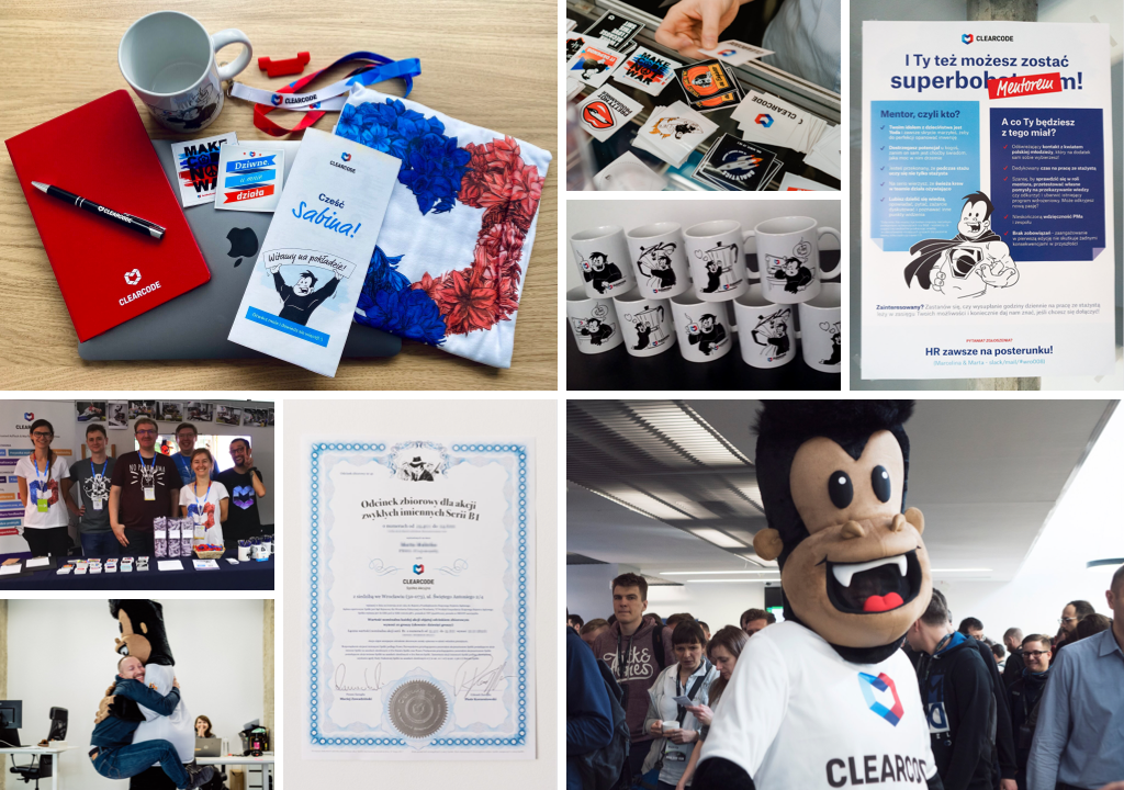
Another interesting outcome of our cooperation was the company mascot. A small idea that gained a life of its own.
A silly illustration of a gorilla on our first website started to appear more and more in our internal materials. We named him Clarence—a name that resembled the name of the company as close as it could.
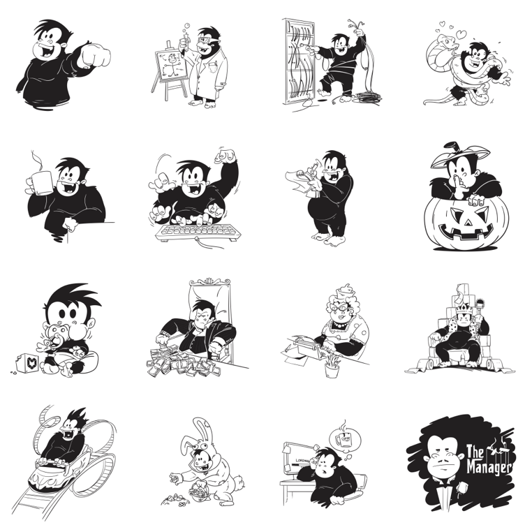
Clarence illustrations
Clarence turned out to be a universal tool helpful in communicating any internal event or matter.
The guerilla gorilla illustrations quickly filled our offices. You could find him on posters, mugs, flyers, and stickers. And finally, as a life–size version that took to the hallways of the office and employer fair halls to entertain both employees and candidates.
