Neptune
Neptune is an experiment tracking and model registry platform used to build advanced, production-ready models. Neptune wants to give machine learning teams the same level of control and confidence when building models as software developers have when shipping applications.
When I joined Neptune, the company was in the process of rethinking its branding strategy. Although the challenge that attracted me to take the job was product design, I’ve used the occasion and proposed changes that could further improve the company’s visual language.
Visual language
I’ve started with thorough research on our competitors and reading through the existing brand strategy, and I’ve proposed two different creative directions. After discussing it with management, we decided to go with a ‘space’ theme—the one that, in our opinion, would best visually reinforce the brand’s message.
On the granular level, I proposed unifying the typography and refreshing the company’s logo. I've introduced a new color palette and started building out a custom icon set. The brand operated in a niche area and used a lot of specialist terms—no generic library could cover all the needs.
I've also made sketches of the website as an example of the application of the new visual language.
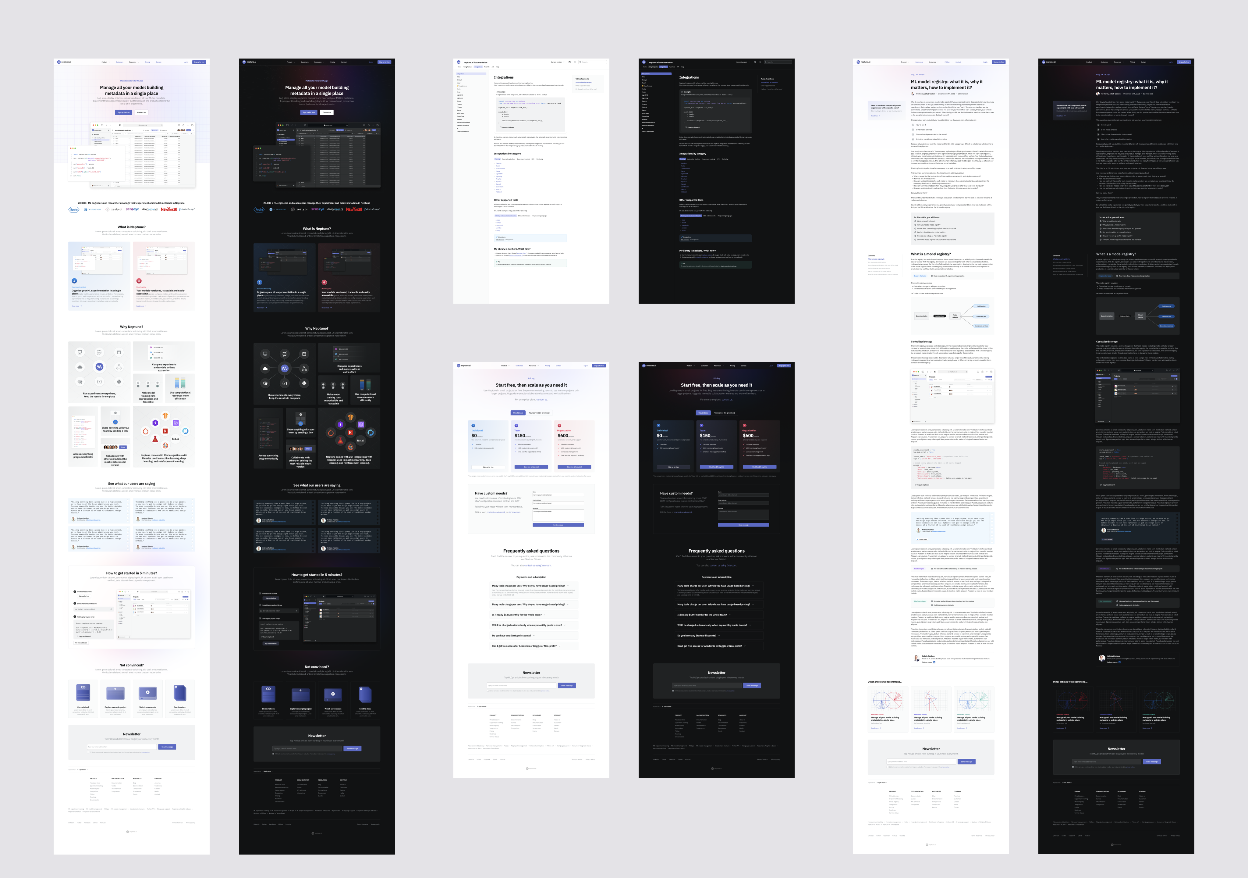
View full size image
Finally, I've helped with recruiting the web designer to carry on with a full website redesign.
I've continued modernizing the visual language on the application side. It was just one of the changes I wanted to pitch, but it meant figuring out its shape at the beginning of the design process.
The design work was unstructured when I joined the company. Transforming the application meant coming up with a precise plan of changes. One visual artifact that helped build a unified and unique visual language, worth mentioning before I start discussing the application design, was detailed documentation of all of the UI components. It was an important element of building a brand's design system and nowadays a crucial factor of a successful user interface design.
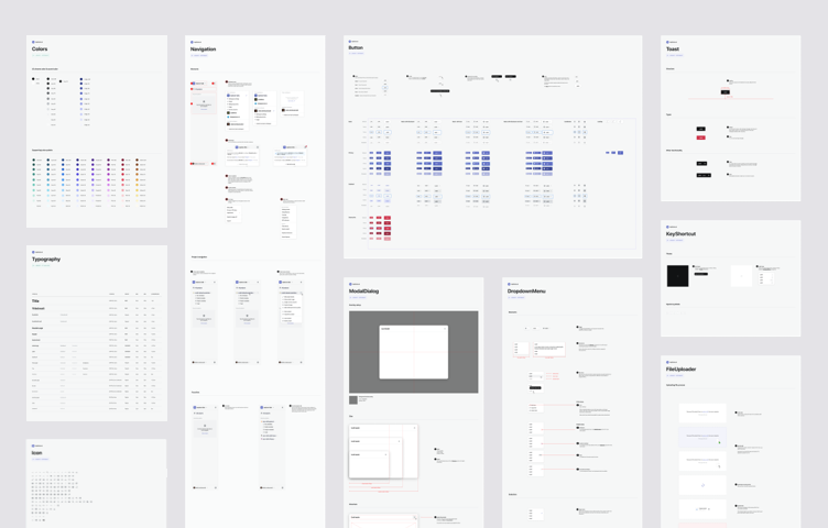
During my work on the application, I kept all of the new UI elements inventoried and well-described to ease the handout process and the work between the product and engineering teams.
I shared the design tokens and design system with brand designers to have as many common elements as possible, leaving them enough creative freedom to express the brand in more visual marketing materials.
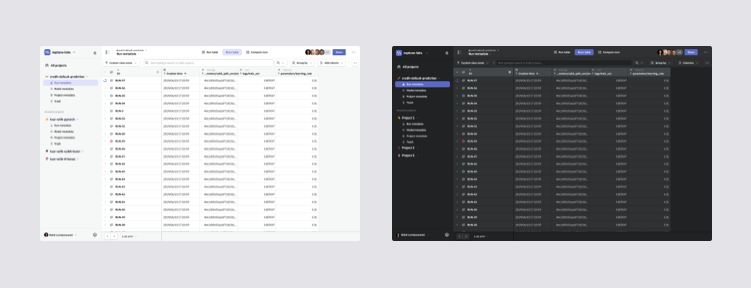
Light and dark theme of Neptune's web client
A tool for people working with code wouldn't be complete without dark mode.
Information architecture & navigation
Before my arrival, the company designed the application using task-based user flows, which first examined the user’s goals, then identified the tasks required to achieve them, and finally put those tasks into a logical sequence and designed the user interface around it.
The main downside of that approach is that it doesn’t help in creating a well-structured and maintainable code. I much prefer an ‘object-oriented’ approach in my work, that models the user experience around the content elements. This helps in creating a scalable and consistent UI.
My initial observations were that this led to a navigation and information structure that could be improved. It was further confirmed when researching user behavior using session recordings gathered in HotJar, and analyzing solutions of our competitors.
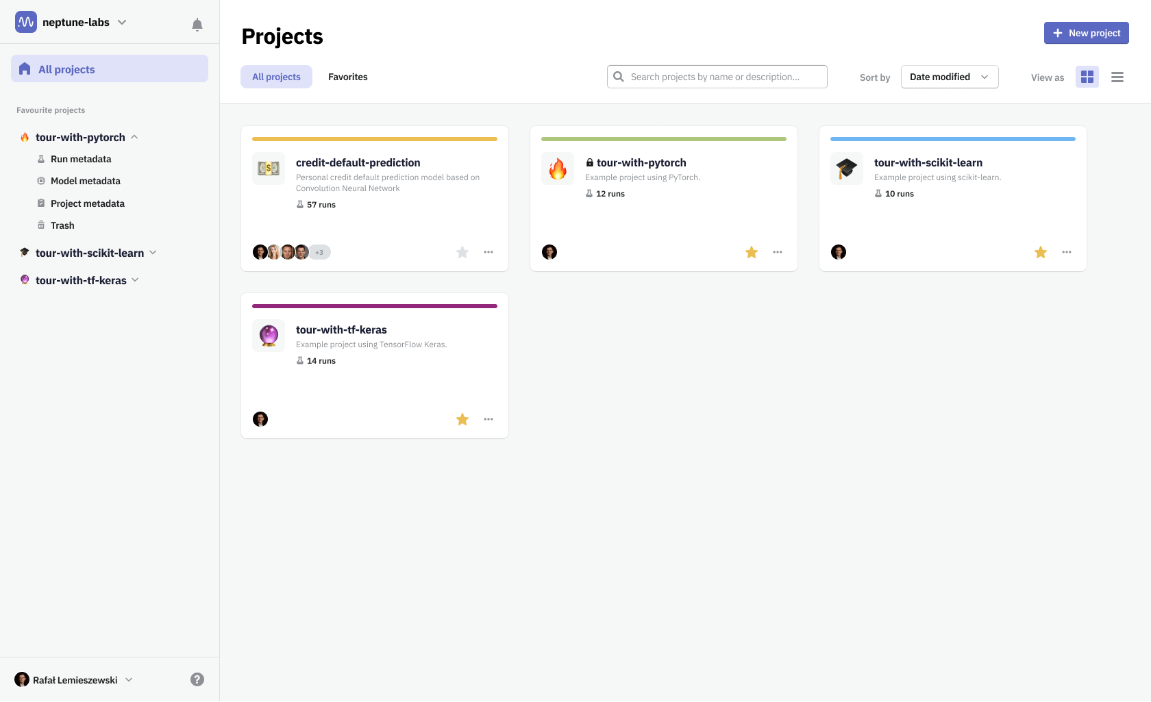
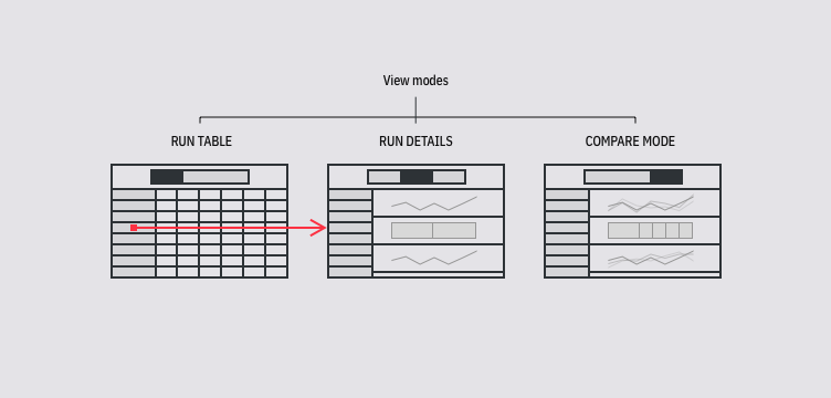
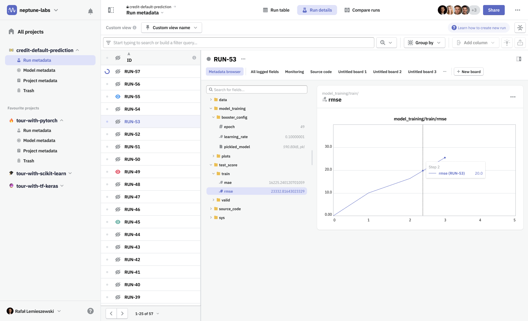
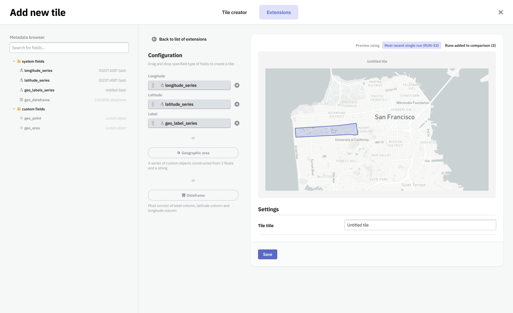
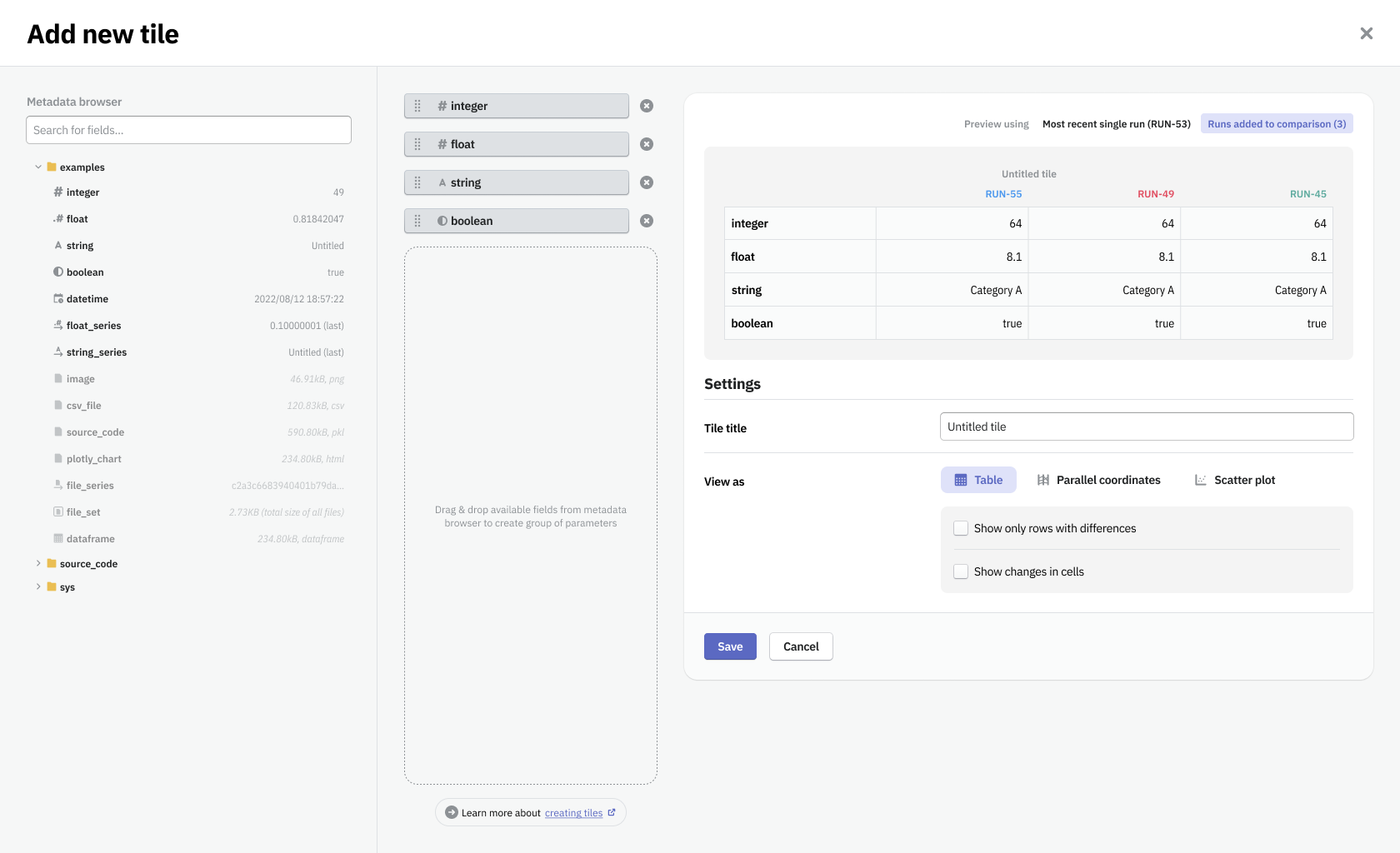
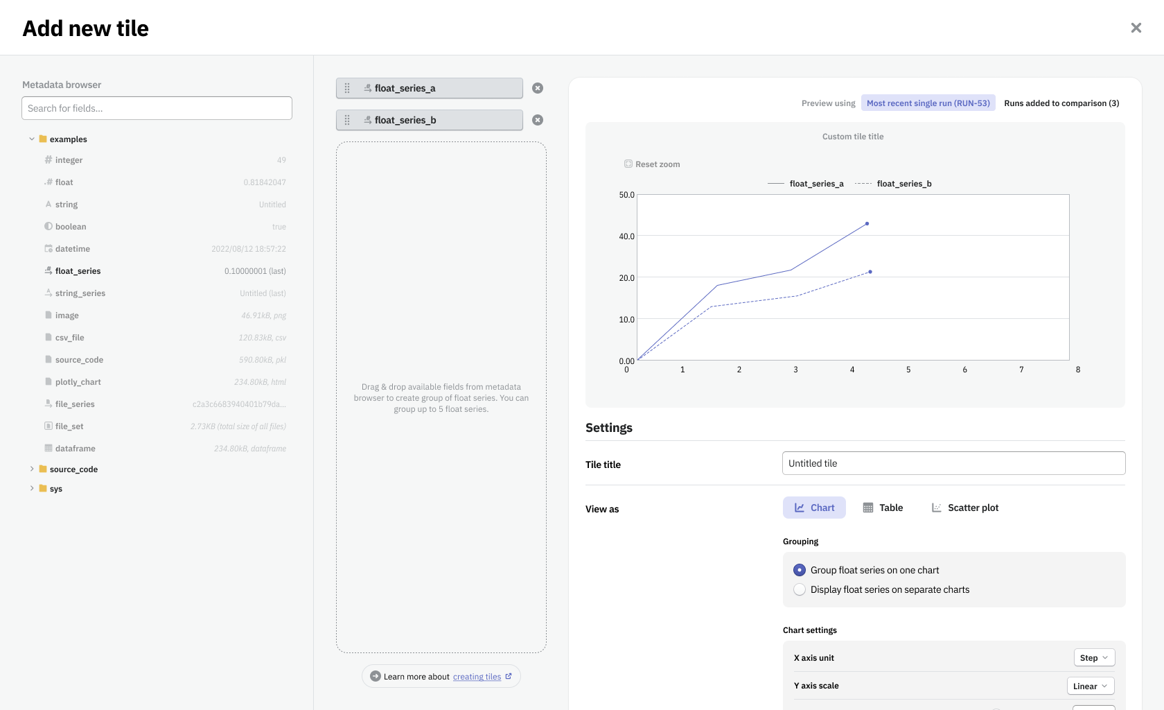
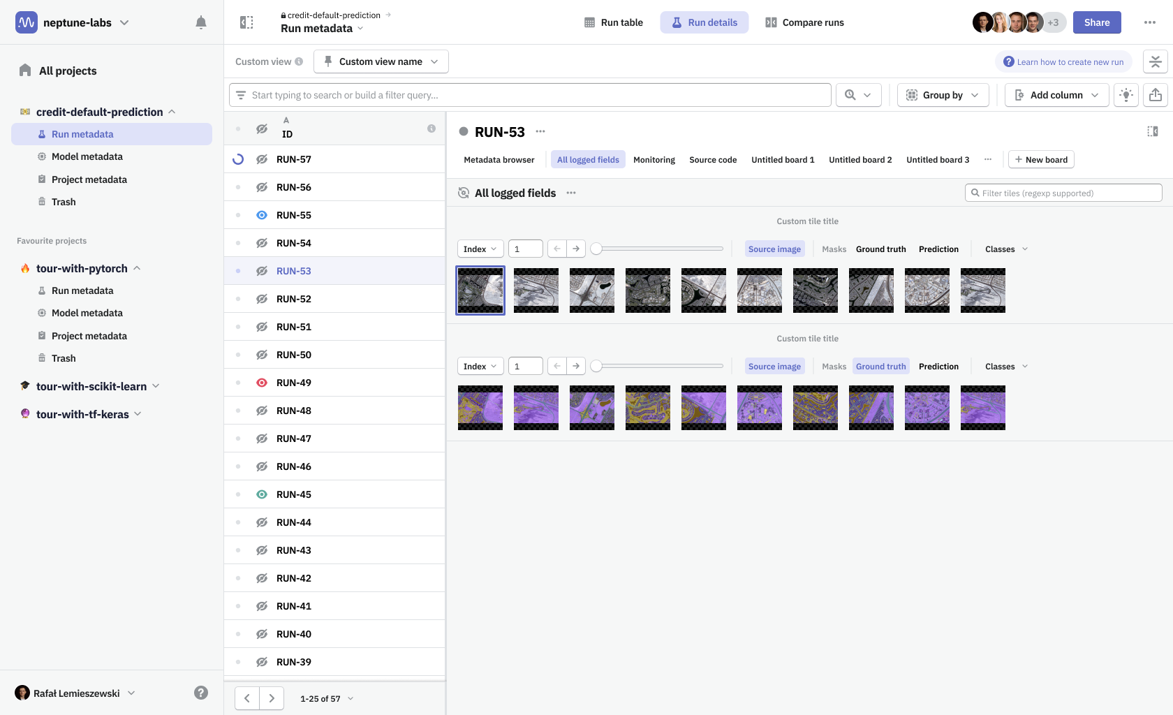
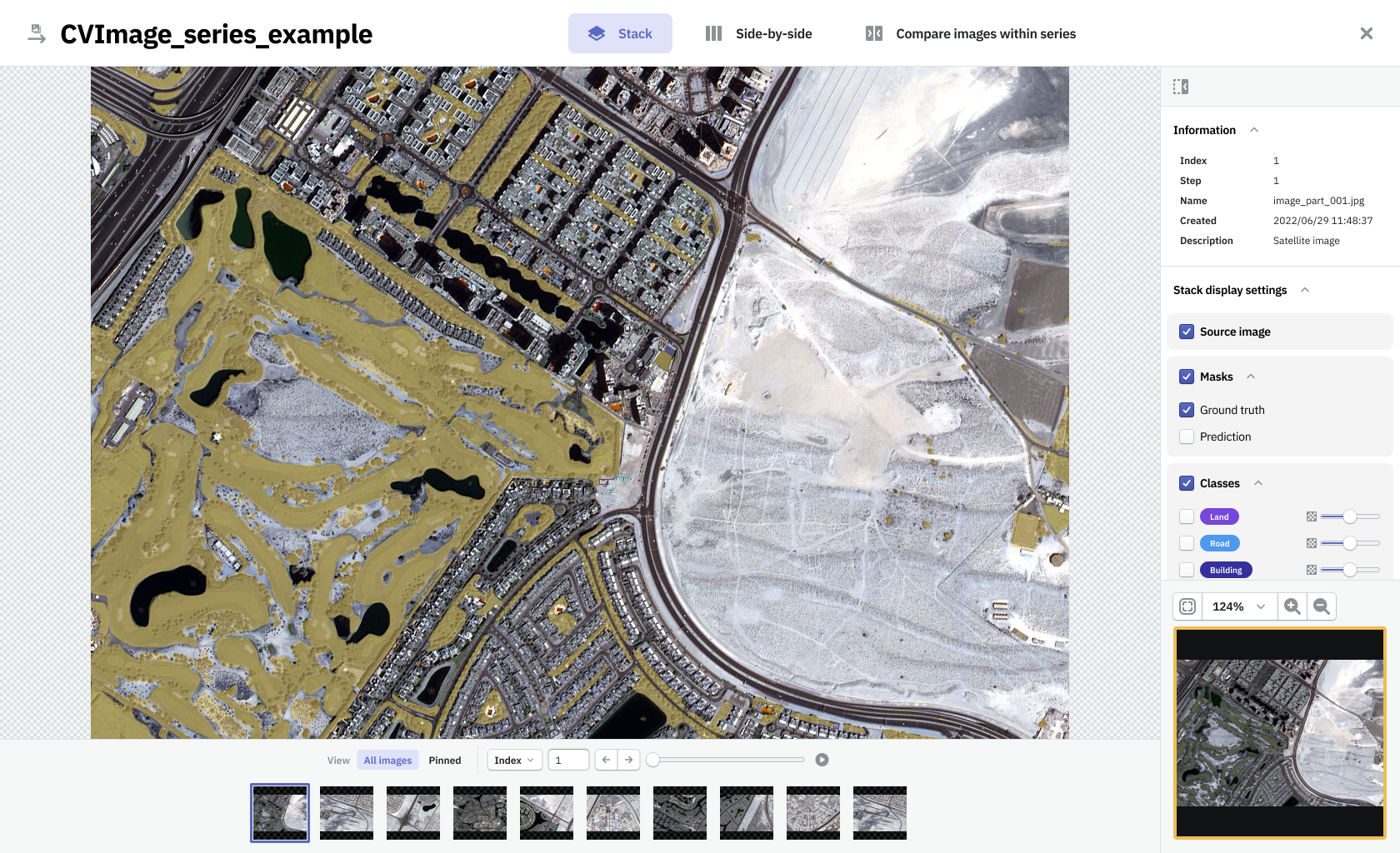
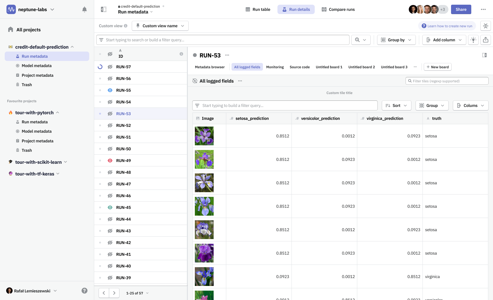
Neptune information architecture is built around projects. In each project, you can log metadata from a python script that is executed to create a machine learning model. One such execution constitutes a run, which was stored in the Run metadata section. Once you develop a model that is worth using, you can gather information on its performance in a different metadata bucket—Model metadata. In addition, you can gather some project-related information in a Project metadata section, which conceptually is a parent to objects mentioned before.
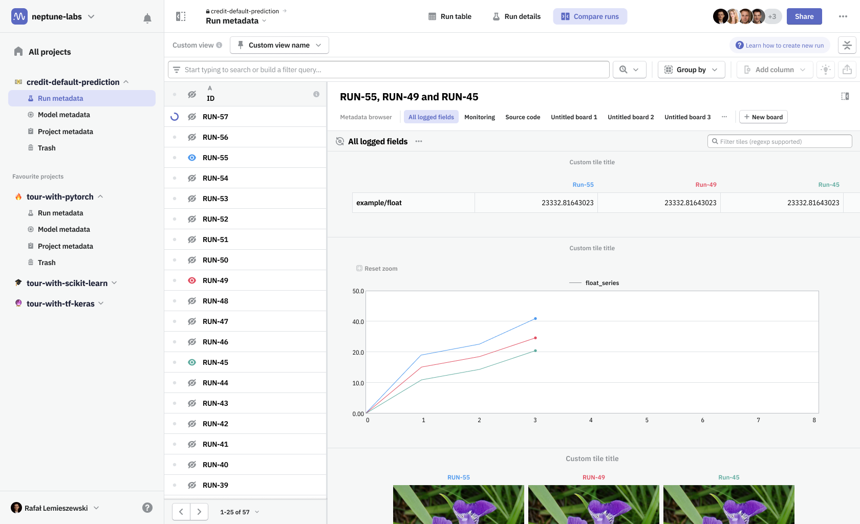
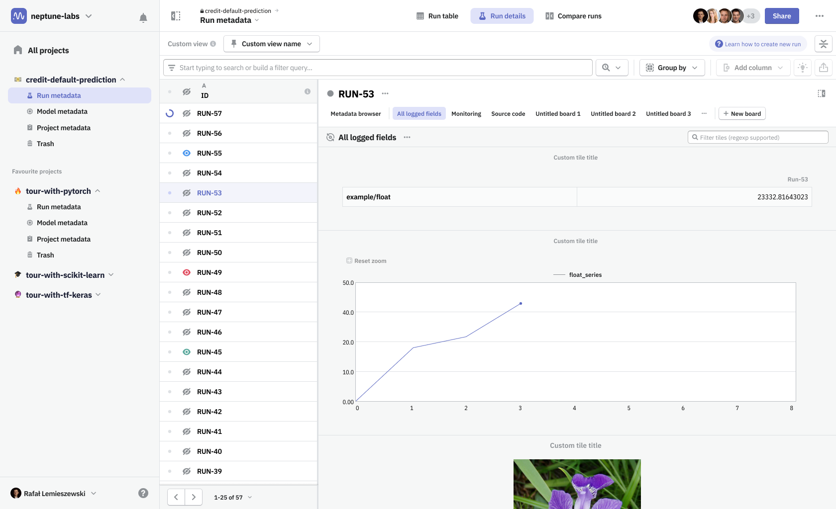
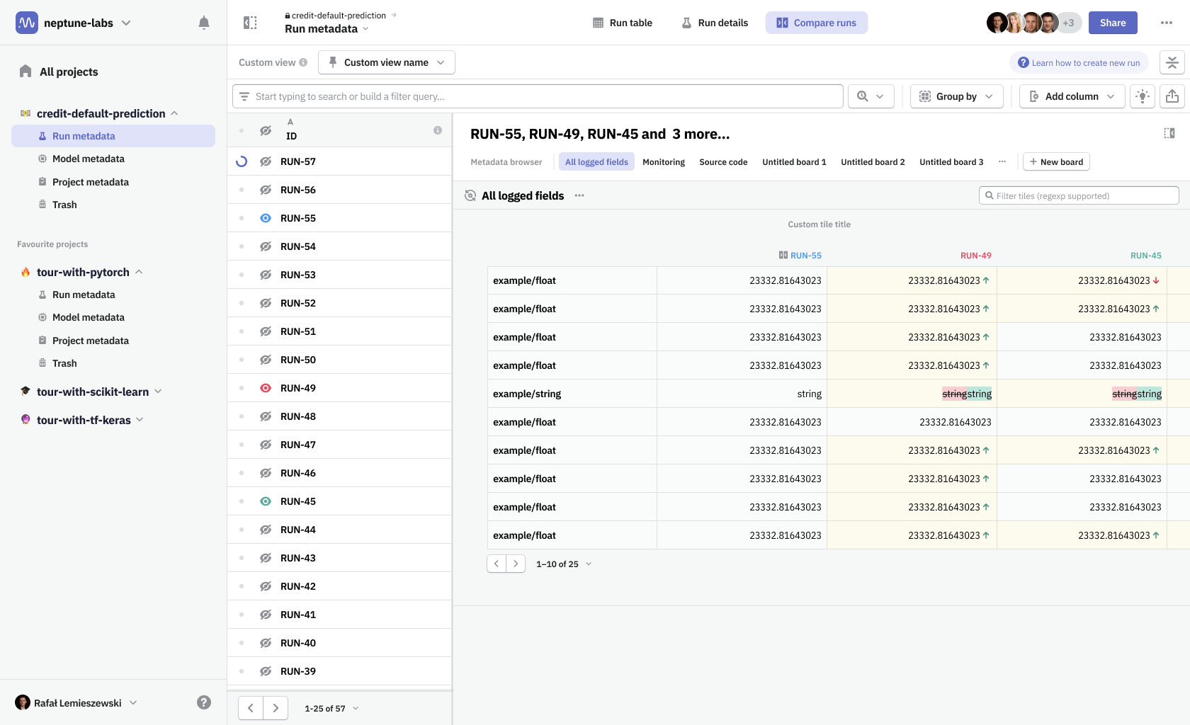
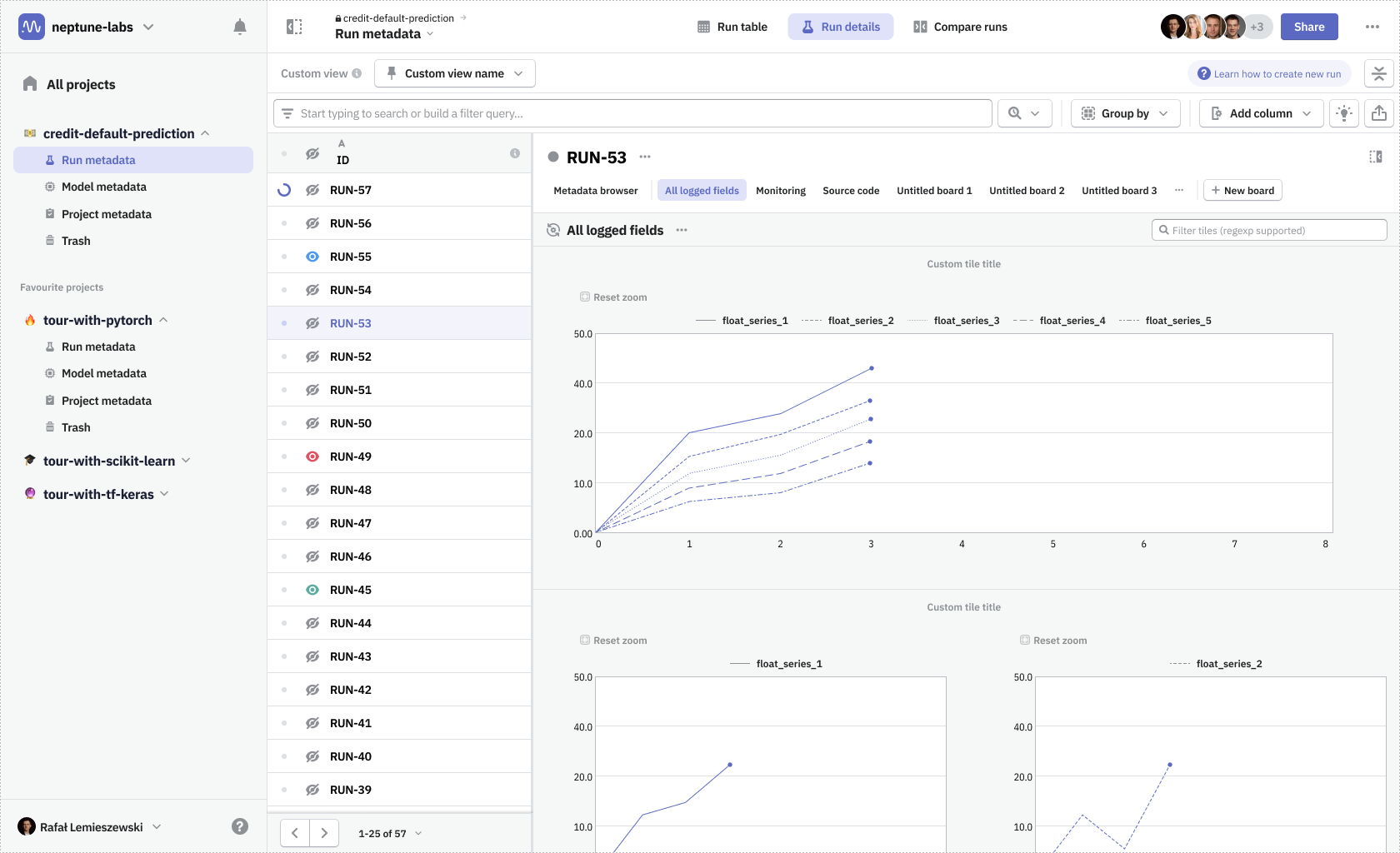
One problematic part was navigating around the nested structure of these metadata object groups (runs and models). I wanted to surface that navigation to be always available at hand. Thanks to that change, and thanks to the introduction of view modes, it was much easier to move between metadata contents of any particular run and quickly compare them with the contents of any other run—whether it’s looking at parameters on the run table or comparing more complex data using dashboards.
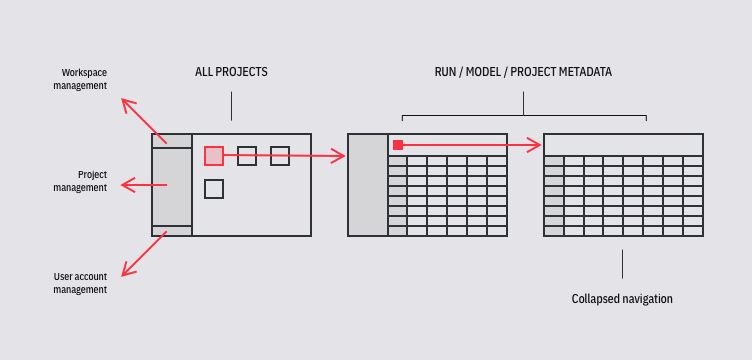
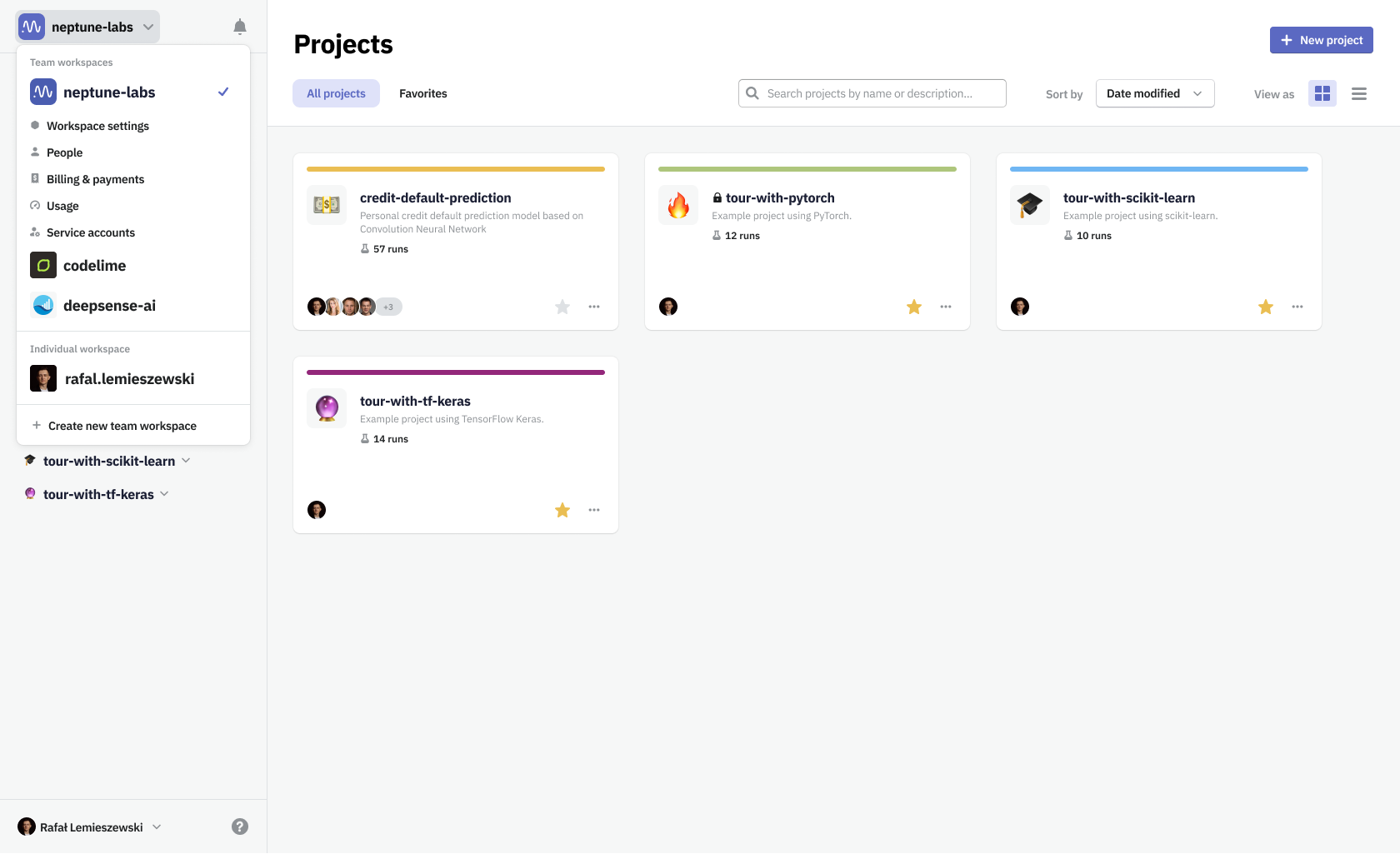
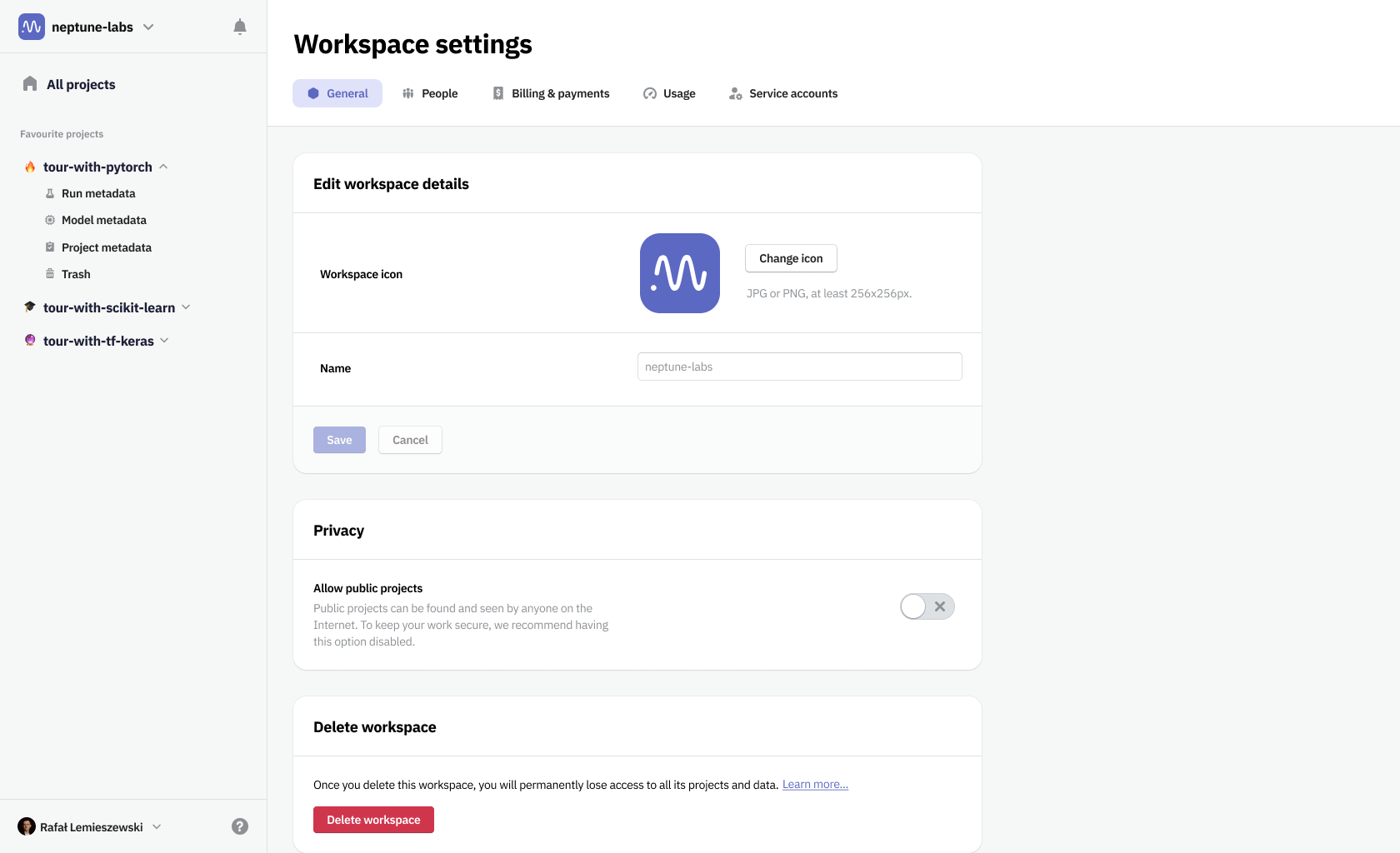
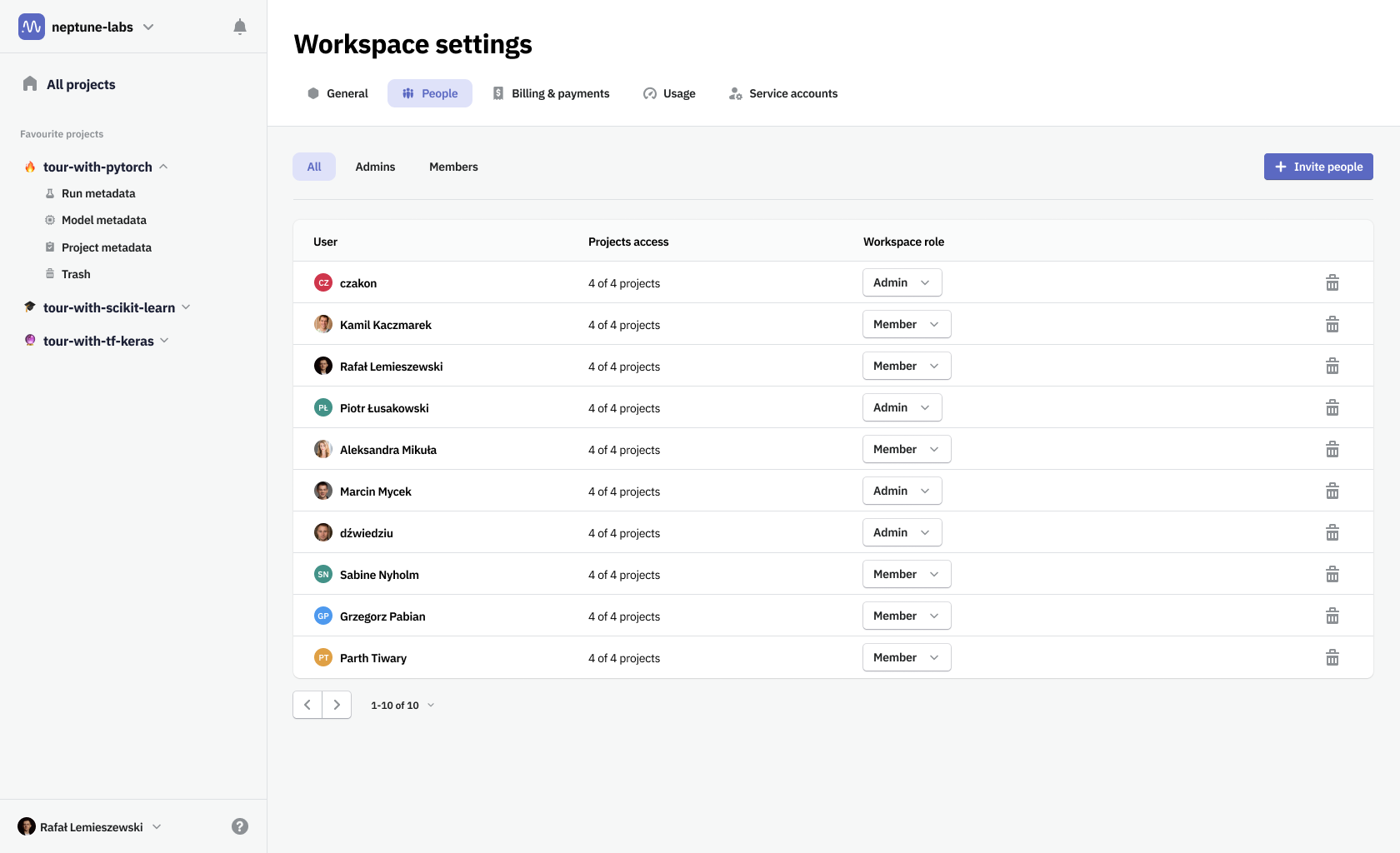
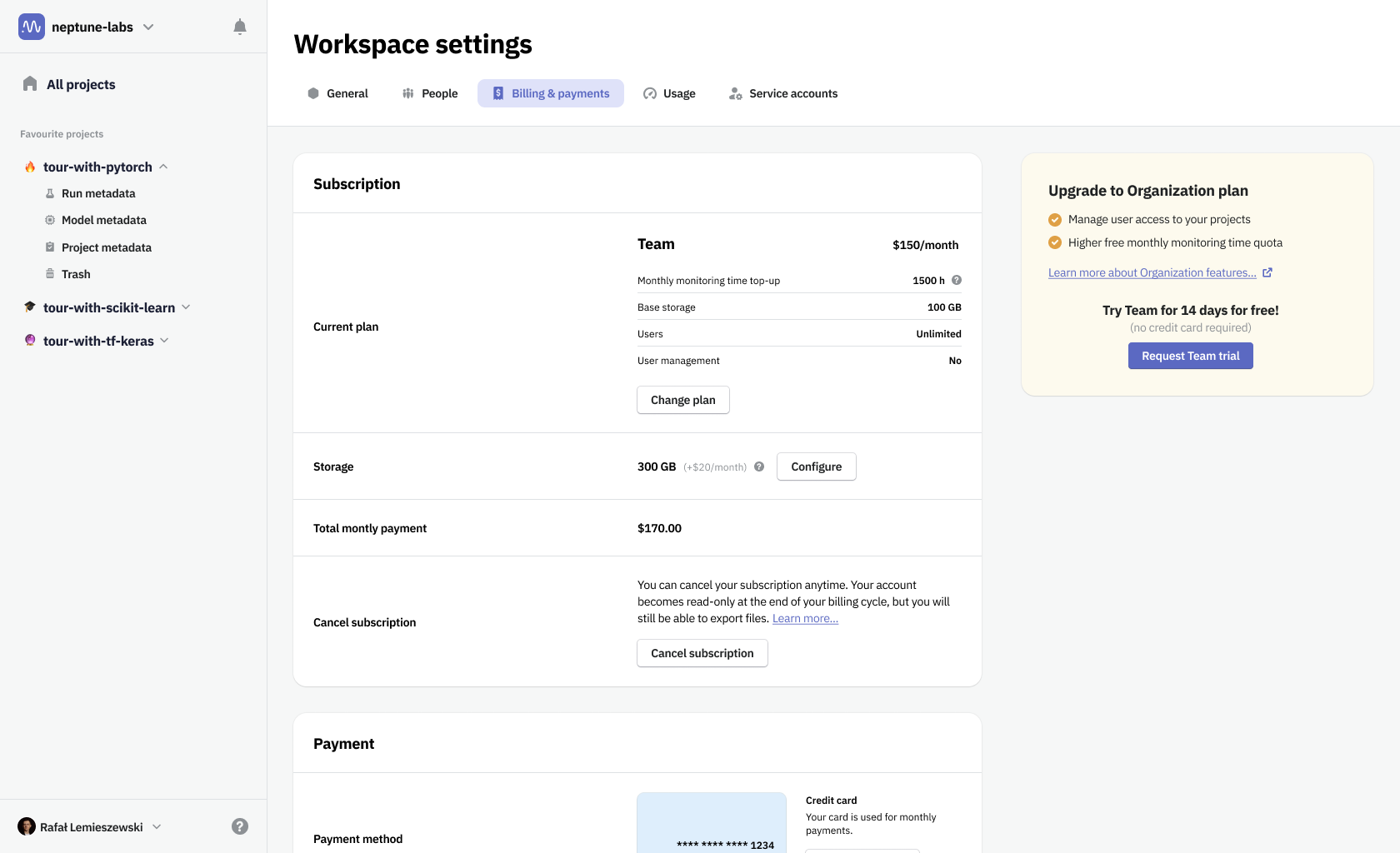
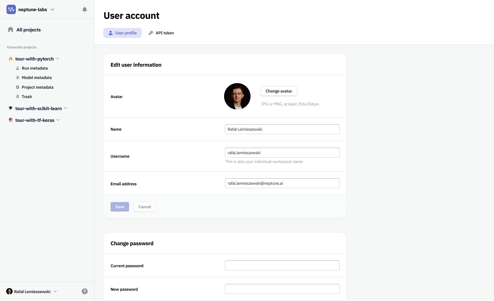
That change forced us to take all the vertical space. It meant moving the main navigation somewhere else. We’ve moved project, workspace, and user account management to the sidebar. It could then be hidden once you enter the project. In effect, we've maximized the space for the user's work.
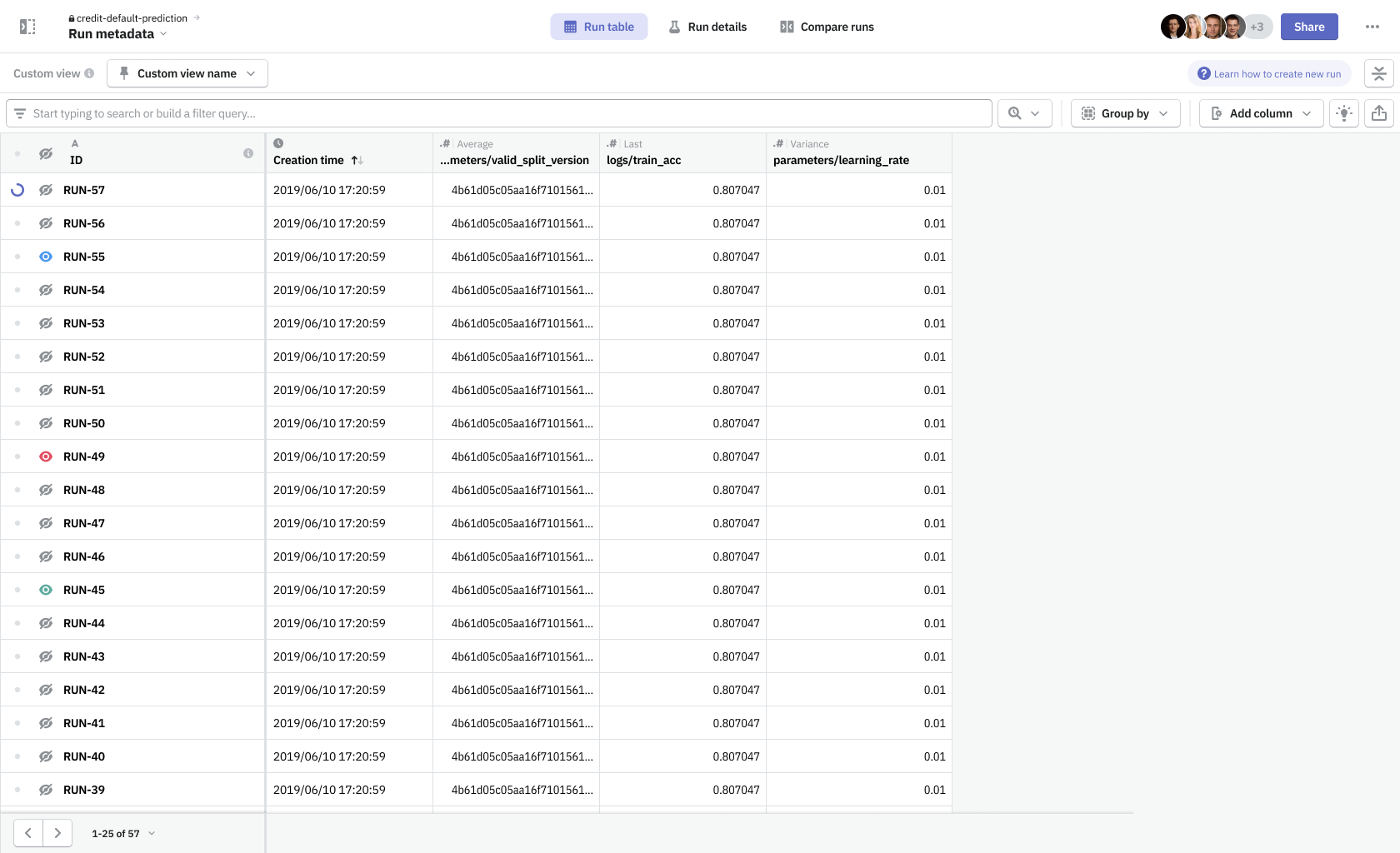
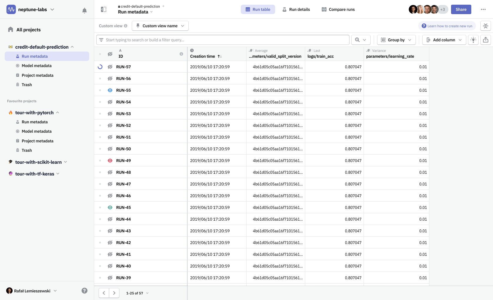
View modes were necessary to combine navigation between different run details and run table, as well as switching the data source from a single run to multiple ones when in comparison mode.
In order to have dashboards working more intuitively, one major change would have to happen in the application.
Boards & tiles
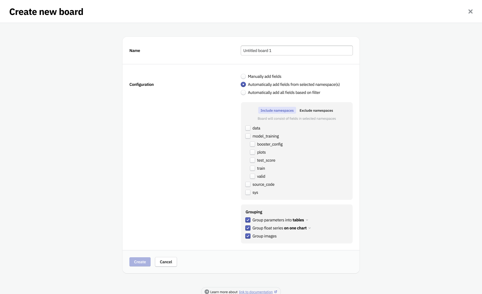
In Neptune you had to create a separate dashboard for a single run and another one for when you’re comparing runs, essentially having two different types of dashboards. For view modes to work seamlessly, we needed to unify both types—a dashboard had to be defined as a collection of metadata items that can be shared among runs. To distinguish the new solution from our old dashboards and widgets system, we named the new design Boards & tiles.
In addition to that I proposed we change how a user creates the content that goes on his boards.
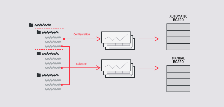
I wanted to have a streamlined way to create boards with minimal effort from the user. To not only be able to create boards manually but also automatically. Previously the only views that collected data automatically were fixed dashboards provided by the platform, there was no possibility for users to customize them.
I've created a system in which, to create an automatic board, all you need is to specify paths (or attributes) to metadata items, that that board should contain. This way all new data logged to Neptune that met the requirements would appear on the board by itself.
This form allowed to simplify the work and speed up the most common tasks users performed with Neptune. It made the platform customizable and gave the user a wide range of methods to improve operations around the responsibilities of a data scientist.
Feedback from users we showed design concepts to was that the experience felt intuitive, simple, and that it would be a time-saver. In addition, it enhanced user onboarding. With a default board we've provided, that showcases all the data types logged by the user, we've minimized the time to the user's ‘aha moment’ when he could experience the value that the software brought him. Our test subjects quickly were noticing what Neptune's unique selling point was.